
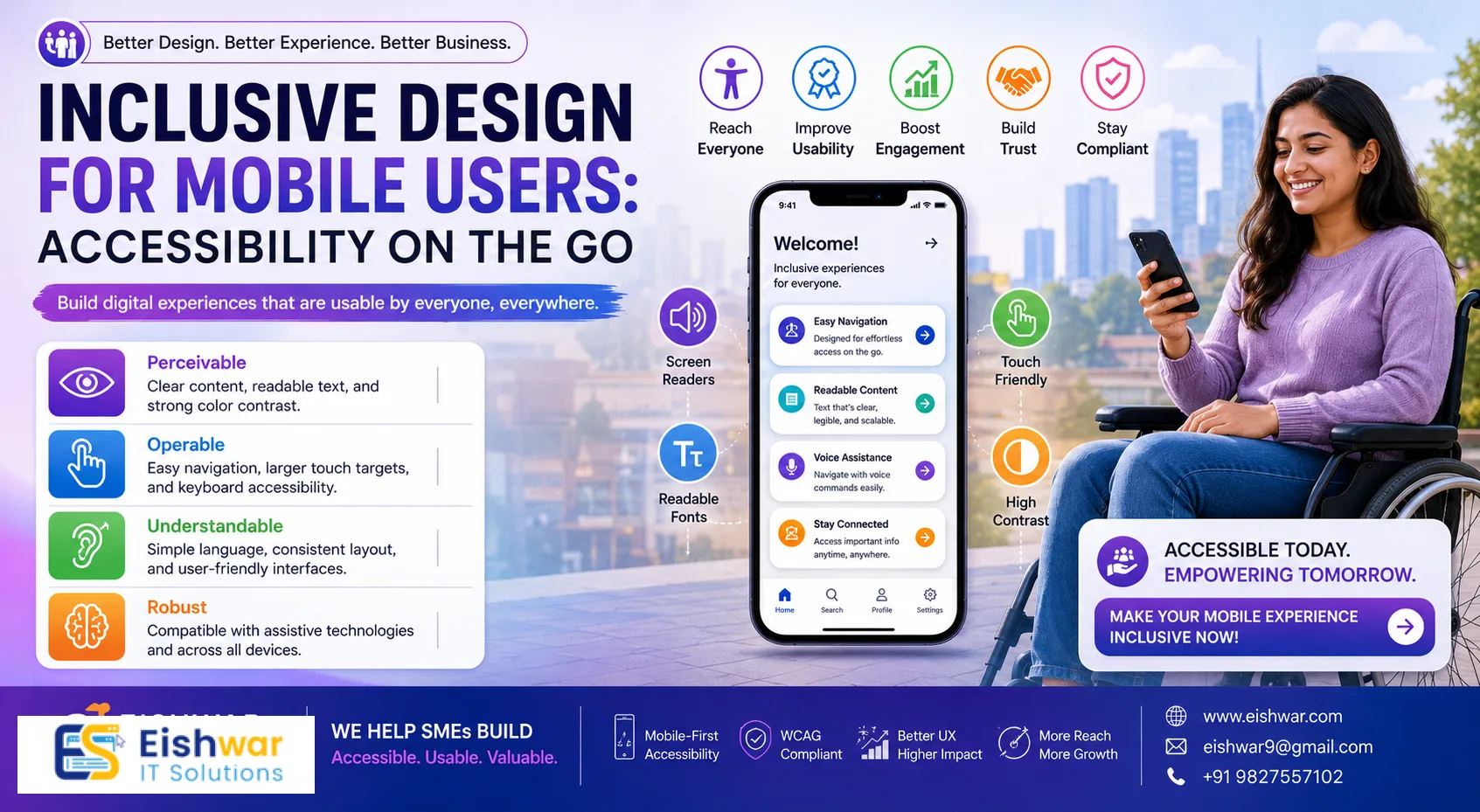
Inclusive Design for Mobile Users: Accessibility on the Go
Published on: 06 Jul 2026
Inclusive Design for Mobile Users: Accessibility on the Go
Introduction
Imagine trying to order food, book a cab, or check your bank balance on a smartphone, but the buttons are too small, the text is blurry, or the screen freezes when you try to zoom. For millions of people with disabilities, this is a daily reality. In India, where mobile-first internet usage is skyrocketing, ensuring your mobile site is accessible isn't just good ethics—it's smart business.
Learn more about our Website services
At EishwarITSolution, we believe that inclusive design is the cornerstone of a truly digital world. Whether you're a business owner, marketer, or professional, making your mobile platform accessible can expand your reach, improve user satisfaction, and boost your bottom line. Let's explore how you can create a mobile experience that welcomes everyone.
Main Section 1: Why Mobile Accessibility Matters
Mobile devices are the primary way most Indians access the internet. According to recent reports, over 70% of web traffic in India comes from mobile phones. Yet, many mobile sites are designed with only able-bodied users in mind.
Consider this: A visually impaired user relies on screen readers like TalkBack (Android) or VoiceOver (iOS). If your site isn't coded properly, they'll encounter unlabeled buttons, confusing navigation, and frustrating dead ends. Similarly, users with motor disabilities may struggle with tiny touch targets or complex gestures. For example, a user with Parkinson's disease might find it impossible to tap a 20-pixel button, while someone with low vision may miss critical information due to poor contrast.
By prioritizing mobile accessibility, you're not just complying with guidelines like WCAG 2.1—you're tapping into a massive, underserved audience. Inclusive design drives loyalty, reduces bounce rates, and even improves SEO. Google rewards mobile-friendly, accessible sites with higher rankings. A practical tip: Start by ensuring your site works well with a screen reader—this alone can catch 80% of common issues.
Main Section 2: Key Principles of Accessible Mobile Design
To design for all, follow these core principles:
- Perceivable: Ensure all content is available to the senses. Provide text alternatives for images, captions for videos, and sufficient color contrast. For instance, use descriptive alt text like 'A woman using a smartphone with a magnifier icon' rather than 'image1.jpg'.
- Operable: Make all interactive elements usable via touch, keyboard, or voice. Avoid time-sensitive actions that can't be adjusted. For example, if a form times out after 5 minutes, allow users to extend the session.
- Understandable: Use clear language, consistent navigation, and predictable behaviors. Error messages should be helpful and easy to fix. Instead of 'Error 404', say 'Page not found. Please use the menu to navigate.'
- Robust: Build with clean, semantic code that works with current and future assistive technologies. Use proper HTML tags like
<button>instead of<div>for clickable elements.
For mobile specifically, pay attention to touch targets (at least 44x44 pixels), font sizes (base 16px or larger), and gesture alternatives (provide buttons for swipe actions). A common example: Instead of requiring a swipe to delete an email, offer a 'Delete' button below each message.
👉 Don't wait for the perfect moment; turn your vision into reality today.
Free ConsultationMain Section 3: Practical Steps to Implement Mobile Accessibility
Ready to make your mobile site inclusive? Here are actionable steps:
- Audit Your Current Site: Use free tools like Google's Lighthouse or WAVE to identify accessibility issues. Test on both Android and iOS devices. For instance, Lighthouse will flag low contrast or missing alt text.
- Optimize Touch Targets: Ensure buttons and links are large enough to tap easily. Add ample spacing between interactive elements to prevent accidental clicks. A good rule: Each target should be at least 44x44 pixels with 8px of padding.
- Improve Color Contrast: Use a contrast ratio of at least 4.5:1 for normal text and 3:1 for large text. Tools like WebAIM's contrast checker can help. For example, avoid light gray text on a white background—use dark gray or black instead.
- Add Alt Text to Images: Describe all meaningful images concisely. Decorative images should have empty alt attributes. For example, a product photo might have alt text 'Blue running shoes with white stripes', while a background pattern should have alt=''.
- Enable Text Resizing: Allow users to zoom up to 200% without breaking the layout. Avoid fixed font sizes. Use relative units like 'em' or 'rem' instead of pixels.
- Simplify Navigation: Use clear headings, logical tab order, and a skip-to-content link. Keep menus simple and predictable. For instance, place the main navigation at the top and use breadcrumbs for deeper pages.
- Test with Real Users: Invite people with disabilities to test your site. Their feedback is invaluable. For example, a user with a motor impairment might reveal that a dropdown menu is too hard to open.
Expert Tips
We asked accessibility experts for their top advice:
- Ravi Kumar, UX Designer: 'Think of accessibility as a feature, not an afterthought. Involve diverse users from the start. For example, include a blind user in your design sprint to test prototypes.'
- Priya Sharma, Digital Marketer: 'Accessible content ranks better. Use descriptive link text and structured data to help both users and search engines. Instead of 'Click here', use 'Read our guide on mobile accessibility'.'
- Anjali Mehta, Accessibility Consultant: 'Don't rely solely on automated tools. Manual testing with assistive technologies is crucial. For instance, use VoiceOver on iOS to navigate your entire site and note any issues.'
Common Mistakes
Avoid these pitfalls:
- Overusing Gestures: Not everyone can swipe or pinch. Provide buttons as alternatives. For example, a photo gallery should have 'Next' and 'Previous' buttons in addition to swipe gestures.
- Ignoring Orientation: Don't lock the screen to portrait or landscape. Let users choose. A user with a mounted device may need landscape mode.
- Poor Form Design: Labels should be visible, and error messages should be specific. Instead of 'Invalid input', say 'Please enter a valid email address (e.g., name@example.com)'.
- Auto-Playing Media: Videos and audio should not play automatically. Give users control. If auto-play is necessary, provide a pause button immediately.
- Neglecting Keyboard Accessibility: Ensure all functions can be accessed via keyboard or external switch devices. For example, a user with a spinal cord injury might use a keyboard instead of touch.
Future Trends
The landscape of mobile accessibility is evolving. Keep an eye on:
👉 Free Website Audit
Get Free Audit- AI-Powered Assistants: Voice interfaces will become more sophisticated, offering hands-free navigation. For example, users could say 'Open my inbox' instead of tapping.
- Gesture Recognition: Advanced sensors may allow users to control devices with facial expressions or eye movements. This could help people with severe motor disabilities.
- Adaptive Interfaces: Sites that automatically adjust based on user preferences and abilities. For instance, a site might detect a user's need for larger text and adjust accordingly.
- AR for Accessibility: Augmented reality can provide real-time captions or navigation cues. For example, AR glasses could display subtitles for a deaf user in a noisy environment.
FAQs
What is mobile accessibility?
Why is mobile accessibility important for businesses in India?
What are the key WCAG guidelines for mobile?
How can I test mobile accessibility for free?
Can accessibility improve my SEO?
What are the most common mobile accessibility mistakes?
How do I start implementing mobile accessibility on a budget?
What is the difference between mobile accessibility and responsive design?
Conclusion
Inclusive design for mobile isn't just a trend—it's a necessity. By making your mobile site accessible, you open doors for millions of users, enhance brand reputation, and future-proof your business. Start small, test often, and always put people first. Remember, every improvement you make benefits not just users with disabilities, but everyone who uses your site.
👉 Free Homepage Demo
Book DemoCTA
Ready to make your mobile site inclusive for everyone? Contact EishwarITSolution today for a free accessibility audit and customized recommendations. Let's build a digital world that works for all.