How to Build a Mobile-First Website for India's Growing Smartphone Users: A Beginner's Guide
Introduction
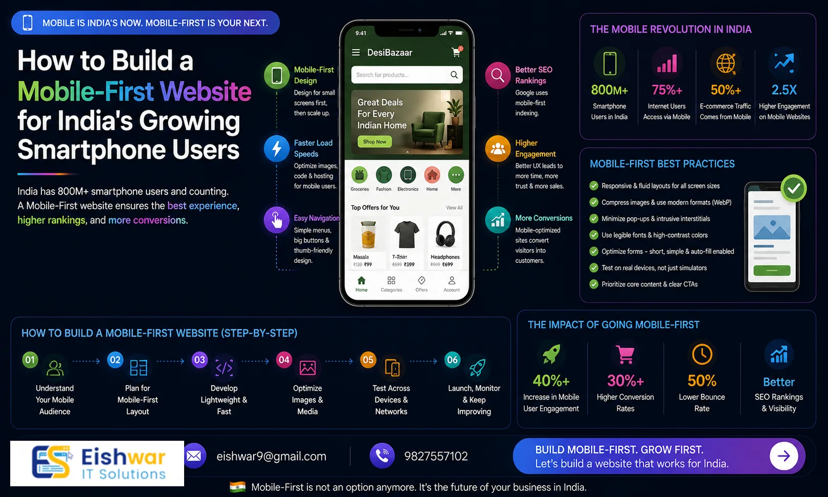
India's smartphone revolution is unstoppable. With over 750 million users and counting, your business website must be built for mobile-first. If your site isn't optimized for small screens, you're losing customers, rankings, and revenue. This guide will show you exactly how to create a mobile-first website that works for India's diverse audience—even if you're a complete beginner.
At EishwarITSolution, we've helped dozens of Indian businesses go mobile-first. In this article, you'll get practical steps, expert tips, and real examples you can apply today. We understand the unique challenges of the Indian market: from budget smartphones to variable network speeds, and we'll address each one.
Why Mobile-First Matters in India
India has the second-largest smartphone user base in the world. Over 70% of web traffic here comes from mobile devices. Google now uses mobile-first indexing, meaning it primarily uses the mobile version of your site for ranking. If your site isn't mobile-friendly, you're invisible on search engines.
Moreover, Indian users have low tolerance for slow or clunky sites. A one-second delay in load time can reduce conversions by 7%. For a small business, that could mean losing dozens of leads every day. Consider this: a local restaurant in Mumbai saw a 20% drop in online orders after their site took more than 5 seconds to load on 4G. After optimizing for mobile-first, they recovered and grew orders by 35%.
Mobile-first doesn't just mean shrinking your desktop site. It means designing for the smallest screen first, then scaling up. This approach ensures a seamless user experience across all devices. For example, a travel booking site that prioritized mobile-first saw a 50% increase in bookings from users in tier-2 cities like Lucknow and Patna.
Section 1: Planning Your Mobile-First Website
1.1 Understand Your Mobile Audience
Who are your users? What devices do they use? In India, budget Android phones with 4-6 inch screens and 3G/4G connections are common. Your site must work well on low-end devices and slow networks. Use tools like Google Analytics to see your audience's device and network data. For instance, if you run an e-commerce store for handmade crafts, you might find that 60% of your visitors use Xiaomi or Samsung phones on 4G. This data helps you prioritize testing on those devices.
Practical Tip: Create user personas for your target audience. For example, 'Priya, a 28-year-old working professional in Bangalore, uses a Redmi Note 10 on Jio 4G. She visits your site during her commute.' Design for her experience.
1.2 Choose a Mobile-First CMS or Framework
WordPress with a responsive theme is a great starter. But consider frameworks like Bootstrap or Foundation that prioritize mobile. For e-commerce, platforms like Shopify or WooCommerce with mobile-optimized themes work well. Avoid heavy frameworks that bloat your site. For example, a local bakery in Delhi switched from a custom desktop-heavy site to a WordPress theme optimized for mobile, reducing load time from 6 seconds to 2.5 seconds.
Expert Tip: If you're building from scratch, use a CSS framework like Tailwind CSS, which allows you to design mobile-first with utility classes. It's lightweight and highly customizable.
1.3 Define Your Mobile Content Strategy
Mobile users scan, not read. Keep content short, use bullet points, and place key information above the fold. Prioritize your most important pages: Home, About, Services, Contact, and Blog. Each page should have one clear goal. For example, a service page for a plumber in Chennai should have a prominent 'Call Now' button and a simple form for booking, not a long paragraph about their history.
Practical Example: A fitness trainer in Pune redesigned their homepage to show a 10-second video testimonial, a bullet list of services, and a 'Book a Free Trial' button. Mobile conversions increased by 40%.
Section 2: Designing for Mobile-First
2.1 Use Responsive Design Principles
Responsive design uses CSS media queries to adapt layout to screen size. Start with mobile breakpoints (320px, 480px) and work up to tablet (768px) and desktop (1024px+). Test on real devices, not just emulators. For instance, a news website in India saw a 25% increase in mobile traffic after ensuring their layout worked on 320px screens, common for older Android phones.
Tip: Use a mobile-first CSS approach: write styles for mobile first, then add media queries for larger screens. This reduces code and improves performance.
2.2 Optimize Touch Interactions
Buttons and links should be at least 48x48 pixels for easy tapping. Leave enough space between elements to avoid accidental clicks. Use gestures like swipe for image galleries, but always provide fallbacks. For example, a recipe blog implemented swipe for photo galleries but also included arrow buttons for users who prefer tapping.
Practical Example: An online clothing store increased add-to-cart clicks by 15% by enlarging their 'Add to Cart' button to 60x60 pixels and adding a 10px margin around it.
2.3 Simplify Navigation
Use a hamburger menu or bottom navigation bar. Limit main menu items to 5-7. Include a search bar. Use breadcrumbs for deeper pages. Avoid pop-ups that cover content—they frustrate mobile users. For instance, a local service directory in Hyderabad replaced a full-screen pop-up with a small banner at the bottom, resulting in a 30% decrease in bounce rate.
Expert Tip: Consider using a sticky bottom navigation bar for key actions (e.g., Home, Search, Cart, Profile). It's thumb-friendly and improves usability.
2.4 Make Forms Mobile-Friendly
Use large input fields, auto-fill, and native keyboard types (e.g., number pad for phone numbers). Minimize required fields. Use progress bars for multi-step forms. Test on actual phones. For example, a loan application form reduced abandonment by 20% after switching to a single-column layout with auto-fill for name and email.
Practical Tip: Use input masking for phone numbers (e.g., +91 98765 43210) to guide users. This reduces errors and speeds up form completion.
Section 3: Performance Optimization for Indian Networks
3.1 Optimize Images and Videos
Compress images using WebP format. Lazy load images below the fold. Use responsive images with srcset. For videos, use YouTube or Vimeo embeds with mobile-friendly players. Avoid auto-playing videos. A travel blog in India reduced page size by 60% by converting all images to WebP and implementing lazy loading, cutting load time from 8 seconds to 3 seconds on 3G.
Expert Tip: Use a tool like TinyPNG or ImageOptim for compression. For responsive images, specify different sizes for different breakpoints (e.g., 320px, 480px, 768px).
3.2 Minimize HTTP Requests
Combine CSS and JavaScript files. Use CSS sprites for icons. Remove unnecessary plugins. Enable browser caching. Use a Content Delivery Network (CDN) with servers in India (e.g., CloudFlare, Akamai). For instance, a small business site reduced HTTP requests from 45 to 12 by combining files and removing unused plugins, improving load time by 40%.
Practical Example: A local restaurant in Kolkata used a CDN with a Mumbai node, reducing load time for users in West Bengal by 1.5 seconds.
3.3 Leverage Accelerated Mobile Pages (AMP)
AMP is a stripped-down HTML framework that loads instantly on mobile. It's great for content-heavy sites like blogs and news. However, it has limitations for interactive features. Consider AMP for key pages only. A news aggregator site in India saw a 50% increase in mobile traffic after implementing AMP for their top 10 articles.
Tip: Use AMP for blog posts and landing pages, but keep your main site responsive for full functionality.
3.4 Implement Progressive Web App (PWA) Features
PWAs offer app-like experiences without an app store. They work offline, load fast, and can send push notifications. Use Lighthouse to audit your PWA readiness. Tools like Workbox simplify implementation. For example, an e-commerce site in Delhi implemented a PWA and saw a 30% increase in repeat visits due to offline browsing and push notifications for sales.
Practical Example: A local grocery delivery service in Bangalore used a PWA to allow customers to browse products even on slow networks, leading to a 20% increase in orders from users in areas with poor connectivity.
Expert Tips
- Test on real devices: Use BrowserStack or maintain a device lab with popular Indian phones (e.g., Xiaomi, Samsung, Vivo). For example, test on a Redmi 9 and a Samsung Galaxy M30 to cover a wide range.
- Monitor Core Web Vitals: Google's metrics (LCP, FID, CLS) are critical for SEO. Aim for LCP under 2.5 seconds. Use PageSpeed Insights to track improvements.
- Use Indian hosting: Choose a host with servers in Mumbai or Bangalore for lower latency. For instance, a host like Hostinger India or Bluehost India can reduce load times by 1-2 seconds.
- Implement AMP for key pages: Especially for blog posts and landing pages to boost mobile traffic. But avoid overusing it—AMP limits design flexibility.
- Leverage local CDN: A CDN reduces load time for users across India's diverse regions. CloudFlare has multiple Indian PoPs, including Mumbai, Delhi, and Chennai.
- Optimize for voice search: With the rise of voice assistants in India, use natural language in your content. For example, include questions like 'Where can I find a plumber in Delhi?' in your FAQ section.
Common Mistakes
- Ignoring mobile usability issues: Use Google Search Console's Mobile Usability report to find and fix problems. For example, fix text that's too small to read or clickable elements that are too close.
- Overusing pop-ups: They block content and annoy users. Use inline banners or slide-ins instead. A travel site replaced a full-screen pop-up with a small banner and saw a 15% increase in newsletter sign-ups.
- Not optimizing for slow networks: Assume 3G speeds. Minimize file sizes and use lazy loading. For instance, a portfolio site reduced load time from 10 seconds to 4 seconds by compressing images and using lazy loading.
- Copying desktop design: Mobile-first means rethinking layout, not just shrinking it. For example, a service page with a three-column layout on desktop should become a single column on mobile.
- Forgetting accessibility: Ensure sufficient color contrast, readable fonts, and proper alt text for images. Use tools like WAVE to check accessibility. For example, a local clinic's site had low contrast text that was hard to read on mobile; fixing it improved user satisfaction.
- Neglecting touch targets: Buttons smaller than 48x48 pixels are hard to tap. Enlarge them and add spacing.
Future Trends
India's mobile landscape is evolving. 5G is rolling out, enabling richer experiences like augmented reality (AR) for product try-ons. Voice search is rising—optimize for conversational queries like 'best restaurant near me' or 'how to fix a leaky tap.' AI-powered personalization will become standard, showing users content based on their behavior. PWAs will replace many native apps, offering app-like experiences without storage constraints. For example, a fashion retailer in India is already using AR to let users 'try on' clothes via their phone camera. Stay ahead by adopting these trends early.
Practical Tip: Start experimenting with voice search optimization by adding a FAQ section with natural language questions. For AI personalization, use tools like Google Optimize to run A/B tests on personalized content.
FAQs
- What is mobile-first design? Mobile-first design means designing for the smallest screen first and then progressively enhancing for larger screens. It ensures a seamless experience on mobile devices, which are the primary way users access the web in India. For example, a mobile-first site might have a single-column layout on a 320px screen and a three-column layout on a 1024px screen.
- How does mobile-first affect SEO in India? Google uses mobile-first indexing, so your mobile site's performance directly impacts rankings. Fast loading, responsive design, and good Core Web Vitals are essential for visibility in Indian search results. A site with a 2-second load time on mobile will rank higher than a 5-second one.
- Do I need a separate mobile site? No, responsive design is recommended over separate mobile sites (m.example.com). Responsive design is easier to maintain and better for SEO. However, AMP or PWA can complement your responsive site. For instance, a news site might use AMP for articles and a responsive design for the rest of the site.
- What is the ideal mobile page load time for India? Aim for under 3 seconds on 3G networks. Use tools like PageSpeed Insights and GTmetrix to measure and improve. Every second counts—users in India are quick to abandon slow sites. A study found that 53% of mobile users in India leave a site if it takes more than 3 seconds to load.
- How can I test my site on real Indian devices? Use services like BrowserStack, Sauce Labs, or maintain a device library with popular models like Xiaomi Redmi Note 10, Samsung Galaxy M30, and Vivo V20. Also, ask friends or colleagues in different regions to test your site. For example, have someone in a tier-2 city test on a 3G connection.
- What is the difference between responsive and adaptive design? Responsive design uses fluid grids and media queries to adjust layout smoothly across screen sizes. Adaptive design uses fixed layouts for specific breakpoints (e.g., 320px, 768px, 1024px). For mobile-first, responsive design is generally recommended because it's more flexible and easier to maintain.
- How do I optimize for low-end devices? Minimize JavaScript, use lightweight fonts (e.g., system fonts like Roboto or Noto), and avoid heavy animations. Test on devices with 2GB RAM or less. For example, a site that used heavy JavaScript animations saw a 30% increase in crashes on low-end phones; removing them improved stability.
Conclusion
Building a mobile-first website is no longer optional for Indian businesses. With over 750 million smartphone users and Google's mobile-first indexing, your site must be designed for small screens, fast networks, and local preferences. By following this guide, you'll create a site that loads quickly, ranks well, and converts visitors into customers. Start with planning, focus on performance, and test relentlessly. Your mobile-first website will be your strongest asset in India's digital economy.
CTA
Ready to build your mobile-first website? Contact EishwarITSolution for a free consultation. We'll help you create a site that India's smartphone users will love. Don't wait—your competition is already mobile-first.