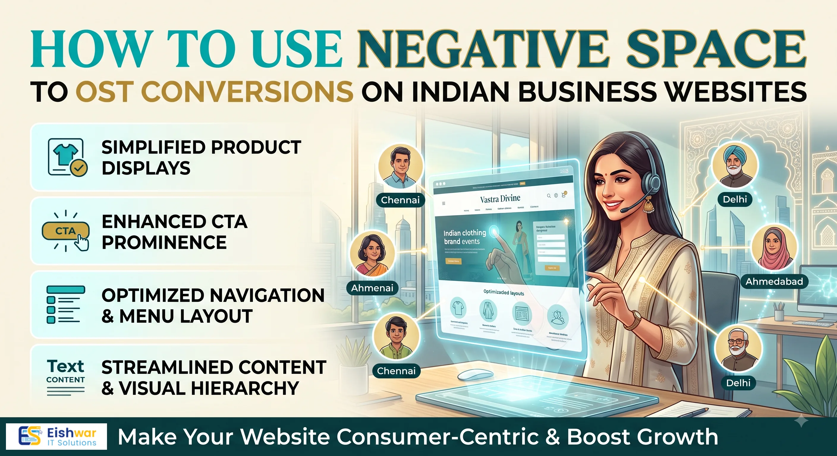
How to Use Negative Space to Boost Conversions on Indian Business Websites
Introduction
When you visit a website that feels cluttered, overwhelming, or hard to navigate, what do you do? You leave. That's where negative space—often called white space—comes in. It's the empty area around elements like text, images, and buttons. It’s not wasted space; it’s a powerful design tool that can guide your visitors’ attention and dramatically improve conversions.
For Indian businesses, where consumers are increasingly mobile-first and have short attention spans, using negative space effectively can set you apart from competitors. In this guide, we’ll explore what negative space is, why it matters for conversions, and how you can apply it to your website to create a clean, focused, and high-converting experience.
Main Section 1: Understanding Negative Space and Its Impact on User Experience
Negative space is the breathing room between design elements. It can be white, colored, or even a blurred background. It helps organize content, improve readability, and create visual hierarchy. When used well, it makes your website feel premium and trustworthy—qualities that are crucial for Indian consumers who often rely on online reviews and first impressions.
Why Negative Space Matters for Conversions
- Guides Attention: By isolating a call-to-action (CTA) with generous whitespace, you make it impossible to miss.
- Reduces Cognitive Load: A clean layout helps visitors process information faster, leading to quicker decisions.
- Enhances Readability: Proper spacing between lines and paragraphs improves comprehension, especially for mobile users.
- Builds Trust: A clutter-free design signals professionalism and reliability.
For example, a local Indian e-commerce store selling handicrafts can use negative space to highlight a "Shop Now" button, making it stand out against a minimal background. This simple change can increase click-through rates.
Main Section 2: Practical Ways to Use Negative Space on Indian Business Websites
Now that you understand the importance, let’s dive into actionable strategies. These are tailored for Indian businesses, considering local user behavior and device usage.
1. Prioritize Key Elements with Generous Spacing
Identify your primary conversion goal—whether it’s a contact form, a phone call, or a WhatsApp chat button. Surround that element with ample negative space to draw attention. For example, if you run a local restaurant, place a "Order Online" button with lots of whitespace above the fold. This ensures that the most important action is the first thing a visitor sees, especially on mobile where screen real estate is limited.
2. Use Negative Space in Navigation and Menus
Avoid cramming too many links in your header. Use dropdowns or hamburger menus to keep the navigation simple. This reduces overwhelm, especially for mobile users who dominate Indian internet traffic. A clean navigation bar with generous padding around each link makes it easier for users to tap the right option, reducing frustration and bounce rates.
3. Optimize Product Pages for Clarity
On e-commerce pages, showcase product images with clean backgrounds and minimal text. Use whitespace around the "Add to Cart" button and price to make them stand out. This is particularly effective for fashion and electronics sites. For instance, a saree retailer can display the product on a plain white background with the price and "Buy Now" button surrounded by whitespace, making the product the hero of the page.
4. Improve Form Design with Space
Forms are critical for lead generation. Use vertical spacing between fields, and consider a single-column layout. This reduces errors and increases completion rates—a win for any Indian service provider. For example, a real estate agent's contact form with generous spacing between name, phone, and email fields is less intimidating and more likely to be filled out than a cramped multi-column form.
5. Use Color and Texture to Define Negative Space
Negative space doesn’t have to be white. Use subtle gradients or patterns that match your brand to create visual interest without clutter. For example, a pastel background with a bold CTA button can be very effective. A travel agency could use a light blue gradient background with a bright orange "Book Now" button, using the contrast to draw the eye without overwhelming the user.
Main Section 3: Real-World Examples and Case Studies from India
Let’s look at some Indian brands that use negative space well and the results they’ve seen.
Case Study: A Mumbai-Based Real Estate Portal
By redesigning their property listing pages with more whitespace around images and a clear "Enquire" button, they saw a 25% increase in lead submissions. The cleaner layout helped users focus on the property details instead of being distracted by ads. They also increased the padding around the property price and location, making it easier for users to scan and compare listings.
Case Study: A Bangalore SaaS Startup
They simplified their homepage, using generous negative space to highlight a single value proposition and a "Start Free Trial" button. This resulted in a 40% boost in sign-ups within two months. The startup removed extraneous text and images, leaving only the core message and a clear call-to-action, which reduced decision fatigue for visitors.
These examples show that even small changes can have a big impact on conversion rates. The key is to understand your users' needs and design with intention.
Expert Tips
- Start with a Mobile-First Approach: Since most Indian users are on mobile, design negative space for small screens first. This means larger buttons, more vertical spacing, and simplified layouts that work well on a 6-inch screen.
- Test Different Spacing: Use A/B testing to find the optimal whitespace around CTAs. Even a 10-pixel increase can matter. For instance, test a button with 20px padding versus 30px padding to see which yields more clicks.
- Use Grids to Maintain Consistency: Grids help create balanced negative space across pages, ensuring a cohesive look. A 12-column grid is a common choice, but you can customize it to suit your content.
- Don’t Overdo It: Too much whitespace can make your site look sparse. Strike a balance between content and space. For example, a blog with excessive whitespace might look unfinished, so keep paragraphs and images well-proportioned.
- Leverage Whitespace in Headers and Footers: Keep these areas clean to avoid distraction from your main content. A minimalist footer with just contact info and social links can enhance the overall user experience.
Common Mistakes
- Filling Every Pixel: Many Indian websites cram content to appear informative, but this backfires by overwhelming users. For instance, a homepage with ten different offers and five banners will confuse visitors, leading to higher bounce rates.
- Ignoring Mobile View: What looks spacious on desktop can be cramped on mobile. Always test on multiple devices. A common mistake is having a desktop layout that doesn't adapt well, causing text to be too small and buttons too close together.
- Using Inconsistent Spacing: Varying margins and paddings can make your site look unprofessional. Consistency in spacing creates a sense of order and reliability, which is crucial for building trust.
- Neglecting Loading Speed: Heavy images and large files can slow down your site, negating the benefits of negative space. Optimize images and use lazy loading to ensure that whitespace doesn't come at the cost of performance.
- Forgetting the CTA: Even with whitespace, if your CTA is weak or hidden, conversions won't improve. Make sure your CTA is prominent, clear, and action-oriented, such as "Get a Free Quote" instead of "Submit."
Future Trends
In 2026, we expect negative space to evolve with more interactive and dynamic designs. For instance, micro-animations that reveal content on scroll can create a sense of spaciousness. Additionally, minimalistic design will continue to dominate, especially for Indian startups that want to convey modernity and trust. Voice search and AI-driven personalization will also influence how whitespace is used—adapting layouts based on user behavior. For example, if a user frequently clicks on a particular section, the site might automatically reduce whitespace there to show more content, while increasing it elsewhere to maintain focus.
FAQs
1. What is negative space in web design?
Negative space (or white space) is the empty area between design elements. It helps improve readability, focus, and overall user experience.
2. How does negative space affect conversion rates?
By guiding attention to key CTAs and reducing clutter, negative space makes it easier for visitors to take desired actions, thereby increasing conversions.
3. Can negative space work for content-heavy websites?
Yes, even content-heavy sites can benefit. Use whitespace to break up text, highlight important points, and create a scannable layout. For instance, a news portal can use whitespace between articles and around headlines to make the page easier to browse.
4. How much negative space is too much?
If your site feels empty or lacks essential information, you’ve overdone it. Balance is key—use whitespace to enhance, not remove, necessary content. A good rule of thumb is to ensure that the user can easily find the main content within the first few seconds of landing on the page.
5. Does negative space impact SEO?
Indirectly, yes. Better user experience leads to longer dwell time and lower bounce rates, which are positive signals for SEO. Search engines like Google prioritize sites that offer a good user experience, so a well-designed layout with proper whitespace can indirectly boost your rankings.
6. What tools can help me test negative space?
Tools like Google Optimize, Hotjar, and Crazy Egg allow you to run A/B tests and heatmaps to see how users interact with your layout. These tools can show you where users click, how far they scroll, and which areas they ignore, helping you refine your use of whitespace.
Conclusion
Negative space is not just a design trend—it’s a strategic tool that can significantly boost conversions for Indian businesses. By giving your visitors room to breathe, you create a more enjoyable and trustworthy experience. Start by auditing your current website, identify cluttered areas, and apply the tips we’ve discussed. Even small adjustments can lead to remarkable results. Remember, the goal is not to eliminate content but to present it in a way that guides users toward action.
CTA
Ready to transform your website’s design and increase conversions? Contact EishwarITSolution today for a free consultation. Our experts specialize in creating clean, high-converting websites tailored for Indian businesses. Get in touch now.