Accessible Typography: Choosing Fonts and Layouts for Readability
Introduction
When we talk about web accessibility, we often focus on alt text, keyboard navigation, and color contrast. But there's one element that affects every single visitor: typography. The fonts and layout you choose can either welcome readers or push them away. For business owners and marketers in India, where diverse languages and reading habits exist, accessible typography is not just a nice-to-have—it's a competitive advantage. Imagine a potential customer in Mumbai trying to read your product description on a mobile phone with low vision, or a student in Chennai with dyslexia struggling through a blog post. The way you present text can make or break their experience. In this guide, we'll explore how to select fonts and structure layouts that maximize readability for all users, including those with visual impairments, dyslexia, and cognitive disabilities. You'll get actionable tips that you can implement today, without needing a complete redesign. From font choices to spacing and alignment, every detail matters. Let's start by understanding why typography is the backbone of accessible design.
Why Typography Matters for Accessibility
Typography is the art of making text legible, readable, and appealing. For people with low vision, dyslexia, or attention disorders, poor typography can make content impossible to consume. According to the World Health Organization, over 2.2 billion people globally have a vision impairment. In India, that number is significant—with millions affected by uncorrected refractive errors, cataracts, and other conditions. By optimizing your typography, you're not just complying with WCAG guidelines—you're opening your business to a larger audience. Good typography reduces cognitive load, speeds up reading, and improves comprehension. It also signals that you care about user experience. And Google rewards accessible sites with better rankings. For example, a study by the Nielsen Norman Group found that users with dyslexia read 10% faster when text is well-spaced and left-aligned. So, let's dive into the specifics of choosing fonts and layouts that work for everyone.
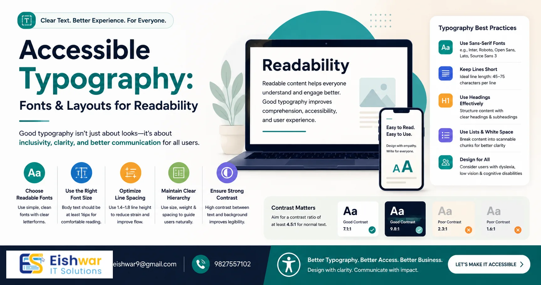
Choosing the Right Fonts
Sans-serif vs. Serif
For digital screens, sans-serif fonts (like Arial, Helvetica, or Open Sans) are generally more readable than serif fonts (like Times New Roman). Serifs can cause visual noise, especially at small sizes, because the tiny strokes blur together on low-resolution displays. However, for headings, a serif font can add personality without sacrificing readability—as long as it's large enough (at least 24px). For example, pairing a sans-serif like Roboto for body text with a serif like Merriweather for headings creates a clear hierarchy. Always test on multiple devices: what looks crisp on a desktop monitor may appear muddy on a mobile screen.
Font Weight and Style
Avoid light or ultra-thin font weights. They reduce contrast and strain the eyes, especially in bright environments. Stick to regular, medium, or bold weights. For body text, a weight of 400 (regular) or 500 (medium) is ideal. Italics should be used sparingly for emphasis, not for long passages, as they are harder to read due to their slanted shapes. Instead, use bold or color to highlight key points. For example, instead of italicizing an entire paragraph, bold a single sentence to draw attention.
Font Size
WCAG recommends a base font size of at least 16px for body text. For mobile, consider 18px because users often hold devices closer to their eyes but in varying lighting conditions. Headings should be at least 1.5x the body size—so for 16px body, H2 should be 24px, and H1 at least 32px. Always allow users to resize text up to 200% without breaking layout. Use relative units like rem or em instead of fixed pixels to ensure scalability. For instance, setting body font-size to 1rem (which defaults to 16px) and headings to 2rem for H1 gives flexibility.
Letter Spacing and Line Height
Increase letter spacing slightly (0.5-1px) for better legibility, especially for dyslexic readers who may confuse similar letters like 'b' and 'd'. Line height should be 1.5 to 1.8 times the font size. This prevents lines from blending together, reducing eye strain. For example, with 16px font, use a line-height of 24-28px. A practical tip: add a small amount of letter-spacing (0.05em) to body text, but avoid overdoing it as it can create gaps. Test with a paragraph of Lorem Ipsum to see if the text feels airy and easy to scan.
Layout for Readability
Column Width
Keep line length between 50-75 characters. Too wide, and the eye struggles to track back to the next line; too narrow, and reading becomes choppy with frequent line breaks. Use CSS to limit max-width on text containers, e.g., max-width: 700px for body text. For multilingual sites, adjust based on script—Devanagari scripts like Hindi may need slightly narrower widths due to complex character shapes. A good rule: test by reading a paragraph aloud; if you lose your place, the column is too wide.
White Space
Generous margins and padding around text blocks improve focus and reduce cognitive load. Avoid cluttered layouts where text touches images or borders. Use white space to separate sections and guide the eye. For example, add 20-30px padding around text blocks and 40-60px margin between sections. This is especially important for users with attention disorders who need clear visual breaks. Think of white space as a breathing room for the eyes.
Alignment
Left-aligned text is easiest to read for left-to-right languages like English and Hindi. Justified text can create uneven gaps that disrupt flow, especially in narrow columns. Centered text is fine for short headings or call-to-action buttons but not for paragraphs. For right-to-left languages like Urdu, use right-alignment. Always maintain consistent alignment throughout the page to avoid confusion.
Headings and Hierarchy
Use a clear heading hierarchy (H1, H2, H3) with consistent sizing and styling. This helps screen readers and skimmers navigate content. Avoid skipping levels—going from H1 to H3 confuses assistive technologies. For example, use H1 for the page title, H2 for main sections, and H3 for subsections. Add visual cues like bold or color to differentiate levels, but don't rely solely on color for meaning. A practical tip: use a larger font size and a different weight for each level, e.g., H1 at 32px bold, H2 at 24px semi-bold, H3 at 20px regular.
Expert Tips
- Test with real users: Include people with disabilities in your usability testing. Their feedback is invaluable. For example, a user with low vision might point out that your font color blends into the background on certain screens.
- Use dyslexia-friendly fonts: Fonts like OpenDyslexic or Lexie Readable are designed to reduce letter confusion. Even sans-serif fonts with distinct letter shapes help, such as Verdana or Tahoma. Avoid fonts where 'l', '1', and 'I' look identical.
- Provide a font switcher: Let users choose between a standard and a high-readability font. This empowers them. For instance, add a toggle in the header that switches from Open Sans to OpenDyslexic, and remember the preference via cookies.
- Check contrast: Ensure text has a contrast ratio of at least 4.5:1 for normal text and 3:1 for large text (18px+ bold or 24px+ regular). Use tools like WebAIM's contrast checker. For example, dark gray (#555) on white (#fff) has a ratio of 5.5:1, which passes.
- Optimize for screen magnification: Test your site at 200% zoom. Ensure text doesn't overflow or get cut off. Use responsive design with flexible containers. For example, avoid fixed-width elements that cause horizontal scrolling at zoom levels.
- Consider language support: If your audience reads in Hindi, Tamil, or other scripts, ensure your font covers those characters. Google Fonts offers many multilingual options like Noto Sans Devanagari. Test with sample text in each language to avoid missing glyphs.
Common Mistakes
- Using all caps for body text: All caps reduces readability by making words look like rectangles. Reserve for short headings or labels. For example, avoid writing entire paragraphs in uppercase—it slows reading by up to 20%.
- Ignoring mobile typography: Many users in India access the web via mobile. Ensure fonts and layouts are responsive. Use media queries to adjust font sizes and line heights for smaller screens. For instance, increase line-height to 1.8 on mobile to compensate for narrower columns.
- Overusing decorative fonts: Fancy scripts or handwritten fonts are hard to read. Use them only for logos or tiny accents. For example, a cursive font for a brand name in the header is fine, but never for body text.
- Neglecting language support: If your audience reads in Hindi, Tamil, or other scripts, ensure your font covers those characters. Google Fonts offers many multilingual options. A common mistake is using a font that doesn't support conjuncts in Devanagari, leading to broken text.
- Inconsistent spacing: Mixing different line heights or letter spacings within the same section creates visual noise. Maintain consistency across the site. For example, use a CSS variable for line-height to ensure uniformity.
Future Trends
Variable fonts are gaining popularity because they allow a single font file to offer multiple weights and styles, reducing load time and improving performance. For example, the font 'Roboto Flex' can adjust weight, width, and slant dynamically. AI-driven personalization may soon let websites adjust typography based on user preferences or detected disabilities, such as automatically increasing font size for users with low vision. Also, more brands are adopting inclusive design as a core value, making accessible typography a standard, not an afterthought. We may see built-in browser features that let users customize typography globally, reducing the burden on developers. Stay ahead by experimenting with variable fonts and testing with diverse user groups.
FAQs
1. What is the best font for accessibility?
There's no single best font, but sans-serif fonts like Arial, Verdana, and Open Sans are widely recommended. For dyslexic users, consider OpenDyslexic. Always test with your audience. For Indian languages, fonts like Noto Sans Devanagari or Laila (for Tamil) are good choices.
2. How do I check if my typography is accessible?
Use tools like the WAVE evaluation tool, axe DevTools, or the Colour Contrast Analyser. Also, manually test by zooming to 200% and using a screen reader like NVDA or VoiceOver. Check that all text is readable and navigation is logical.
3. Can I use custom fonts and still be accessible?
Yes, as long as the custom font is legible, has good contrast, and supports the languages you need. Avoid overly stylized fonts for body text. Use web font services like Google Fonts that optimize for performance and accessibility.
4. What line height should I use for accessibility?
WCAG recommends a line height of at least 1.5 times the font size. For body text, 1.6 to 1.8 is comfortable. For example, with 16px font, use line-height: 1.6 (25.6px). Adjust for larger fonts proportionally.
5. How does typography affect SEO?
Google considers user experience signals like time on page and bounce rate. Good typography keeps readers engaged, which can boost rankings. Also, clear headings help search engines understand your content structure, improving snippet generation.
6. What is the ideal column width for readability?
Aim for 50-75 characters per line. Use CSS max-width to constrain text containers. For example, set max-width: 65ch where 'ch' is the character unit. This ensures consistent line length across font sizes.
7. How do I handle typography for multiple languages on the same site?
Use a font stack that includes fallbacks for each script. For example, for English and Hindi, use 'Noto Sans', 'Noto Sans Devanagari', sans-serif. Test each language separately to ensure proper rendering and spacing.
Conclusion
Accessible typography is not a trend—it's a fundamental part of inclusive design. By choosing readable fonts, optimizing layout, and following best practices, you make your website welcoming to everyone. In a diverse market like India, this can set you apart. Start small: pick one font change or adjust your line height today. Your users will thank you. Remember, accessibility is an ongoing process—regularly test with real users and update your typography as new tools and fonts emerge. Every improvement you make creates a more inclusive web for all.
Call to Action
Ready to make your website accessible to all? Contact EishwarITSolution for a free accessibility audit. Let's build a web that works for everyone. Our team will review your typography, layout, and overall user experience to ensure compliance with WCAG standards. Reach out today and take the first step toward inclusive design.
CTA
Ready to make your website accessible to all? Contact EishwarITSolution for a free accessibility audit. Let's build a web that works for everyone. Our team will review your typography, layout, and overall user experience to ensure compliance with WCAG standards. Reach out today and take the first step toward inclusive design.