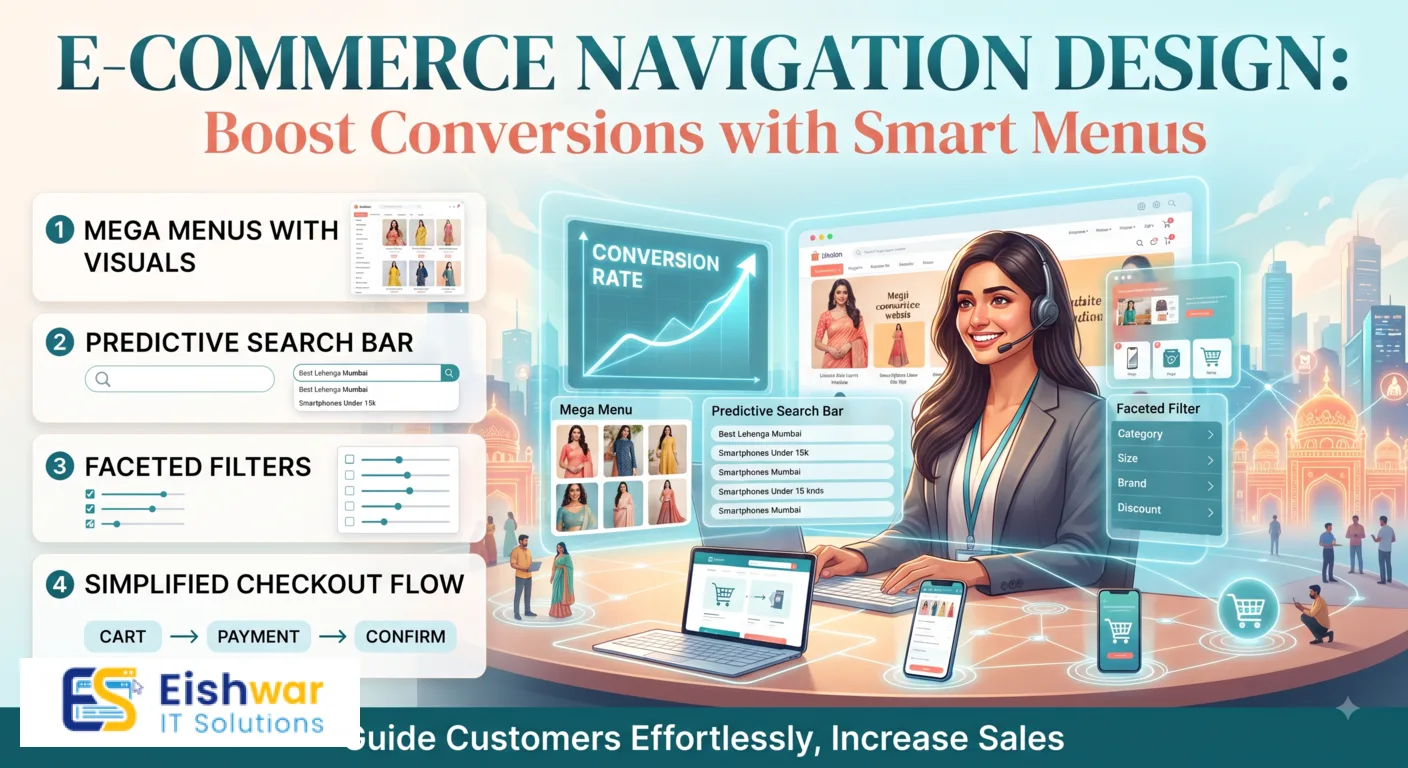
E-commerce Navigation Design: Boost Conversions with Smart Menus
Introduction
Imagine walking into a physical store where products are scattered randomly, no aisle labels, and you can't find the checkout counter. Frustrating, right? That's exactly how visitors feel when your e-commerce website has poor navigation. In India's booming online market, where users expect speed and simplicity, navigation can make or break your sales. At EishwarITSolution, we've seen stores double their conversions just by cleaning up their menus. This guide will show you how to optimize your e-commerce navigation for maximum conversions in 2026.
Main Section 1: Why Navigation Matters for Conversions
Navigation is the roadmap of your online store. It helps users find products, learn about your brand, and complete purchases. Poor navigation leads to high bounce rates and cart abandonment. According to a study by Baymard Institute, 50% of users leave a site if they can't find what they want quickly. For Indian users, who often shop on mobile with limited data, every second counts. Well-organized navigation reduces friction, builds trust, and increases average order value. When customers can easily browse categories, they discover more products and add them to cart. For example, a well-structured navigation can reduce the time to find a product from 30 seconds to under 5 seconds, directly impacting conversion rates. In fact, a 1-second delay in page load can cost you 7% in conversions, so efficient navigation is critical.
Main Section 2: Key Navigation Best Practices for Indian E-commerce
Keep It Simple and Predictable
Use a clear hierarchy: main categories, subcategories, and product pages. Avoid dropdowns with too many levels. For example, an Indian clothing store should have 'Men', 'Women', 'Kids' as top-level links, then 'Kurtas', 'Jeans', 'Ethnic Wear' under each. Predictable navigation means users don't have to guess where things are. A practical tip: limit top-level categories to 5-7 items to prevent decision fatigue. For instance, an electronics store might use 'Mobiles', 'Laptops', 'Accessories', 'Deals', and 'Support'. This simplicity helps users navigate quickly, especially on mobile devices.
Use Mega Menus for Large Inventories
If you have hundreds of products, mega menus work well. They display multiple categories and subcategories in a grid, often with images. For instance, an electronics store can show 'Laptops', 'Mobiles', 'Accessories' with popular brands like Apple, Samsung, and OnePlus. Mega menus reduce clicks and help users scan quickly. A best practice is to include a 'Shop All' link at the top of each category column, and use icons or thumbnails for visual appeal. For example, a fashion retailer could show a grid with 'Men', 'Women', 'Kids', each with subcategories like 'Shirts', 'Jeans', 'Ethnic Wear', accompanied by small product images.
Optimize for Mobile
Over 70% of Indian e-commerce traffic comes from mobile. Use a hamburger menu or bottom navigation bar. Ensure touch targets are at least 48px. Test on slow connections. A sticky search bar at the top helps users find products instantly. For example, Flipkart uses a bottom navigation bar with icons for 'Home', 'Search', 'Cart', and 'Account', making it easy to access key features with one thumb. Additionally, consider a 'Sticky Add to Cart' button on product pages to streamline purchases.
Include a Search Bar
Search is a critical navigation tool. Place it prominently with a placeholder like 'Search for sarees, electronics...'. Enable autocomplete and filters. For Indian stores, support local languages like Hindi or Tamil to cater to non-English speakers. For instance, Amazon India offers search in multiple languages, which increases usability. A practical example: a grocery store could allow users to search for 'दाल' (dal) and see results in Hindi. Also, implement voice search for hands-free browsing.
Use Breadcrumbs
Breadcrumbs show users where they are (e.g., Home > Women > Kurtas). They reduce back clicks and improve SEO. They also help users navigate deeper without losing context. For example, on a product page, breadcrumbs like 'Home > Electronics > Mobiles > iPhone 15' allow users to easily go back to the category. Ensure breadcrumbs are clickable and use a consistent separator like '>' or '/'. This is especially useful for stores with deep category hierarchies.
Highlight Key Pages
Include links to 'Offers', 'New Arrivals', 'Best Sellers', and 'Track Order'. These pages drive conversions. For Indian festivals like Diwali, add a temporary 'Festive Deals' link in the main menu. For example, during the festive season, Myntra adds a 'Big Fashion Festival' link with a countdown timer, which increases urgency and clicks. Also, consider a 'Sale' badge or icon to draw attention.
Main Section 3: Advanced Navigation Strategies for Higher Conversions
Personalized Navigation
Use AI to show relevant categories based on user behavior. For example, if a user frequently buys sports shoes, show 'Sports' section first. This increases relevance and average order value. EishwarITSolution can help implement such personalization. A practical example: Amazon shows 'Recommended for You' based on browsing history. For Indian stores, personalization can include regional preferences, like showing 'Kurtis' for users in North India and 'Sarees' for those in South India.
Progressive Disclosure
Show only the most important options first. For instance, on the homepage, show 'Shop by Category' and 'Deals of the Day'. As users scroll, reveal more specific links like 'Under ₹500' or 'Premium Collection'. This reduces overwhelm. For example, a furniture store might first show 'Living Room', 'Bedroom', 'Office', and then expand to 'Sofas', 'Tables', 'Chairs' on hover. This technique keeps the interface clean and guides users naturally.
Visual Navigation
Use icons or thumbnail images next to menu items. For example, a camera icon next to 'Photography Gear'. Visual cues speed up recognition. Indian users respond well to colorful, culturally relevant imagery. For instance, a food delivery app could use a '🍕' icon for pizza and a '🍔' for burgers. In e-commerce, icons for 'Electronics', 'Fashion', 'Home' can make navigation intuitive, especially for users with low literacy.
Sticky Navigation
Keep the main menu fixed at the top while scrolling. This ensures users can always jump to another section. But on mobile, make it compact to avoid taking too much screen space. For example, Amazon's sticky header includes the logo, search bar, and cart icon, while the menu is hidden behind a hamburger icon. A practical tip: on mobile, use a sticky bottom bar with key actions like 'Home', 'Search', 'Cart', 'Account', and 'Menu'. This improves accessibility without cluttering the screen.
A/B Test Your Navigation
Test different layouts, labels, and placements. For example, compare a horizontal menu vs a sidebar on desktop. Measure click-through rates and conversion rates. Use tools like Google Optimize or VWO. A real-world example: an online bookstore tested 'Shop by Genre' vs 'Shop by Author' and found a 15% increase in clicks with genre-based navigation. Also, test the placement of the search bar—top vs center—to see which yields more searches.
Expert Tips
- Limit menu items: Keep top-level navigation to 5-7 items. Too many choices paralyze users. For example, a fashion store might use 'Women', 'Men', 'Kids', 'Sale', 'New Arrivals'.
- Use descriptive labels: Avoid jargon. Instead of 'Apparel', use 'Clothing'. Instead of 'Footwear', use 'Shoes'. For Indian users, use terms like 'Kurtis' instead of 'Tunics'.
- Add a 'Help' or 'FAQ' link: Reduces support calls and helps users find answers. Place it in the footer or as a floating icon.
- Implement 'Quick View': Allow users to see product details without leaving the category page. This reduces friction and increases add-to-cart rates.
- Use heatmaps: Tools like Hotjar show where users click. Adjust navigation based on real data. For instance, if users frequently click on a non-clickable element, consider making it a link.
- Optimize for voice search: With the rise of voice assistants, ensure your navigation supports voice commands like 'Show me red sarees under ₹2000'.
Common Mistakes
- Overloading the menu: Adding too many categories confuses users. Stick to essentials. For example, avoid listing every product type; group them under broader categories.
- Hiding the search bar: Make it visible, not behind a tap. Users rely on search. A hidden search bar can increase bounce rates by 20%.
- Ignoring mobile users: Desktop navigation doesn't work on phones. Mobile-first design is a must. Test on multiple devices and screen sizes.
- Using generic labels: 'Products' is vague. Use specific terms like 'Smartphones' or 'Kurtis'. For example, 'Electronics' is better than 'Gadgets'.
- No clear call-to-action: Ensure 'Cart', 'Checkout', and 'Login' are easy to find. Use contrasting colors for buttons.
- Neglecting accessibility: Ensure navigation is keyboard-friendly and has proper ARIA labels for screen readers.
Future Trends
By 2027, voice navigation will become common. Users will say 'Show me red sarees under ₹2000' and get results instantly. Visual search, where users upload images to find products, will also rely on smart navigation. Augmented reality (AR) will let users 'try on' clothes, requiring seamless navigation between virtual and real. Indian e-commerce stores that adopt these trends early will lead the market. For instance, IKEA's AR app allows users to place furniture in their homes, and similar features will become standard. Additionally, AI-driven predictive navigation will anticipate user needs, showing relevant categories before they even search.
FAQs
1. What is the best navigation structure for a small e-commerce store?
For small stores (under 50 products), a simple list of categories on the homepage or a single dropdown works. Use 'Shop All' as the primary link. Avoid mega menus. For example, a handmade jewelry store could have categories like 'Necklaces', 'Earrings', 'Bracelets', and 'Shop All'. This keeps navigation straightforward and fast.
2. How can I improve navigation for repeat customers?
Use personalized navigation showing recently viewed items, wishlist, and order history. Allow them to reorder quickly. For instance, Amazon shows 'Buy Again' for repeat customers. Also, consider a 'Favorites' section in the menu for quick access to saved items.
3. Should I use a sticky header on mobile?
Yes, but keep it minimal. Include the logo, search icon, cart, and menu. Avoid cluttering with extra links. For example, a sticky header with just these four elements ensures quick access without taking up too much screen space. On mobile, consider a sticky bottom bar instead for key actions.
4. How do I handle navigation during sales or festivals?
Create a temporary 'Sale' link in the main menu with a countdown timer. Use banners to highlight deals. Ensure the navigation remains fast under traffic spikes. For example, during Diwali, Flipkart adds a 'Big Diwali Sale' link with a timer, which increases urgency. Also, consider a 'Deals of the Day' section in the menu.
5. What tools can I use to test navigation?
Use Google Analytics for user flow analysis, Hotjar for heatmaps, and Crazy Egg for A/B testing. Also, conduct user testing with real Indian users. For example, use Hotjar to see where users click most and adjust menu items accordingly. A/B test different menu labels to see which drives more clicks.
6. How can I make navigation accessible for users with disabilities?
Ensure navigation is keyboard-friendly, use ARIA labels for screen readers, and provide high-contrast colors. For example, use 'aria-label' for menu buttons and ensure all links are focusable. Also, avoid relying solely on color to indicate active states.
7. What is the role of breadcrumbs in navigation?
Breadcrumbs show users their current location and allow easy backtracking. They improve SEO by creating internal links. For example, 'Home > Electronics > Mobiles > iPhone 15' helps users navigate back to 'Mobiles' without using the back button. They are especially useful for stores with deep category hierarchies.
Conclusion
Optimizing e-commerce navigation is not a one-time task—it's an ongoing process. Start with clean, simple menus, test with real users, and iterate based on data. For Indian businesses, focusing on mobile and local language support can set you apart. Remember, every click saved is a conversion earned. If you need expert help, EishwarITSolution is here to design navigation that sells.
CTA
Ready to transform your e-commerce store? Contact EishwarITSolution today for a free consultation on navigation optimization. Let's boost your conversions together.