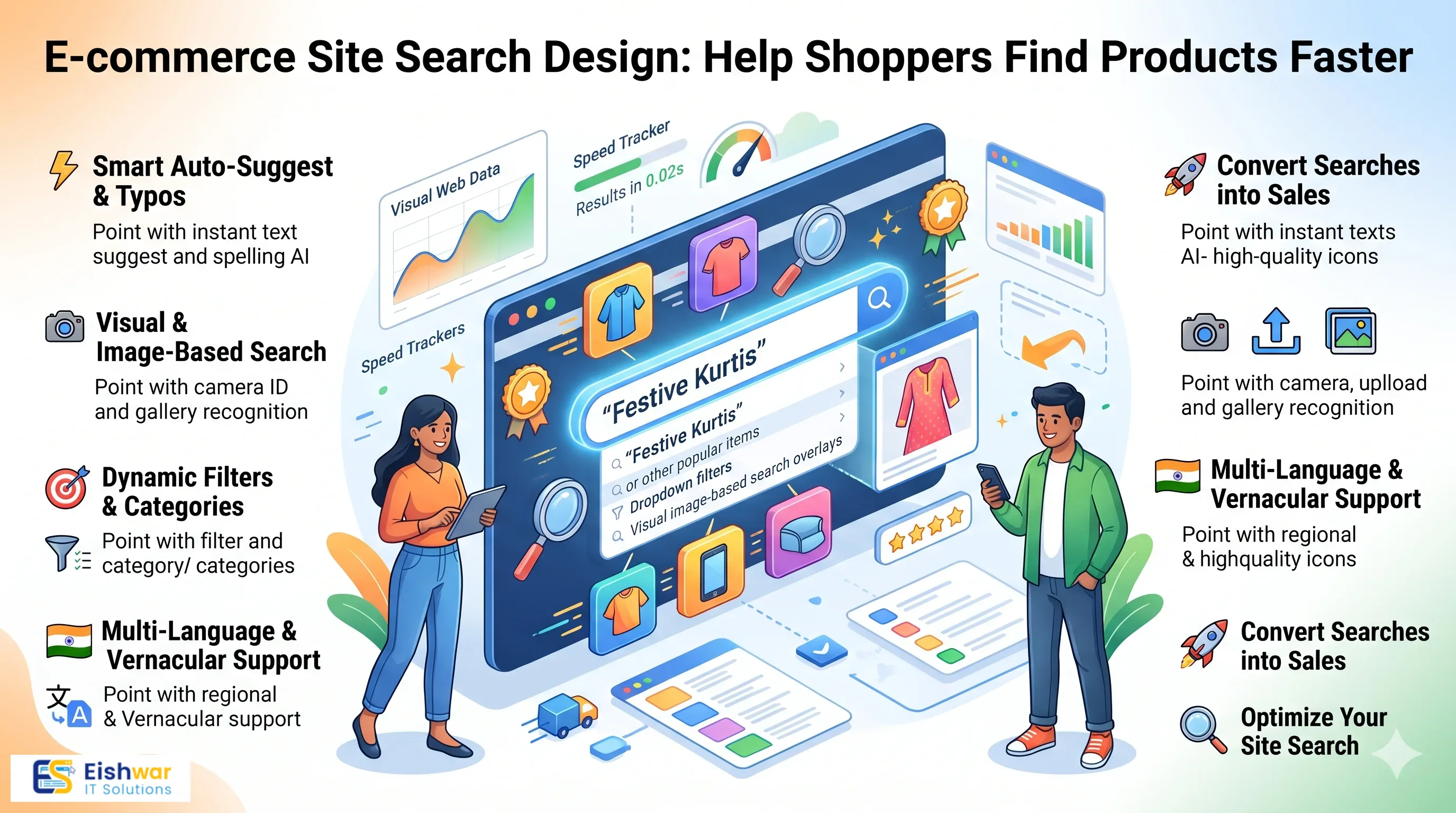
E-commerce Site Search Design: Help Shoppers Find Products Faster
Introduction
An Indian shopper opens your e-commerce website with a clear intention: find a blue cotton kurta under Rs 1,500, a phone cover for a specific model, or a gift that arrives before Friday. If your site search cannot understand that intent, the shopper does not browse harder. They leave and try another store. That is why e-commerce site search design is no longer a small UX detail. It is a direct sales lever.
Search and filters are how modern shoppers navigate large catalogs. They reduce decision fatigue, shorten the path to purchase, and make your store feel intelligent. For business owners and marketers in India, the opportunity is even bigger because shoppers often type in Hinglish, use regional product names, and search on small mobile screens with one thumb.
This guide breaks down practical e-commerce site search design ideas for 2026. You will learn how to design search bars, autocomplete, filters, results pages, and zero-result recovery so Indian shoppers find products faster and buy with less friction.
Main Section 1: Why E-commerce Site Search and Filters Decide Sales
Site search is not the same as browsing. A shopper who types a query is telling you exactly what they want. That is high-intent behavior. They are not casually scrolling. They are trying to complete a task. If your search bar is hidden, slow, or inaccurate, you break that task at the worst possible moment.
Filters have a similar role. A large catalog can feel overwhelming. Filters turn a messy shelf into a guided shopping experience. For Indian e-commerce stores, filters are especially important because shoppers compare on price, delivery date, cash-on-delivery availability, ratings, offers, and return policies before they commit.
Search Is a High-Intent Shortcut
A shopper who searches is closer to buying than a shopper who scrolls. They have already decided the product category, the use case, or the brand. Your job is to remove every step between that query and the product page.
Example: A shopper types 'cotton kurta for office'. Your search results should show relevant kurtas, not a generic homepage or an empty page. If your store sells fashion, the search experience should understand synonyms such as kurta, kurti, tunic, and office wear. If your store sells electronics, it should understand model numbers, brand names, and common misspellings.
On mobile, the search bar should be easy to reach. Do not hide it behind a tiny icon in a corner. A sticky search strip below the header, a full-width search field on the homepage, and a clear search icon in the top navigation can all work. The goal is simple: a shopper should never have to hunt for the search bar.
Filters Turn Browsing into Buying
Indian shoppers compare aggressively. They want to know the price, the discount, the delivery estimate, the COD option, the rating, and the return window. Filters help them narrow the catalog without calling support or opening five tabs.
Useful filters for Indian e-commerce stores include size, color, fabric, brand, price range, discount, material, occasion, delivery estimate, COD availability, and customer rating. Not every store needs every filter. But every store needs the filters that match how its customers actually shop.
Example: A shopper looking for a wedding saree may filter by fabric, color, price, and delivery date. If those filters are buried below ten promotional banners or hidden inside a slow accordion, the shopper may never reach the right product. A clean filter panel with visible counts and a clear 'Apply' button feels respectful of their time.
Measure What Matters
Do not judge site search by how modern it looks. Judge it by what shoppers do after they use it. Track search conversion rate, search exit rate, zero-result rate, filter usage, time to first product click, and revenue from search.
If search users convert well but many searches return zero results, you have a catalog or synonym problem. If filter usage is high but cart adds are low, your filters may be too restrictive or your product cards may lack the information shoppers need. If mobile search usage is high but mobile search exits are also high, the mobile search experience needs urgent attention.
Main Section 2: Designing Search That Handles Indian Shopper Language
Indian shoppers do not always search in perfect English. They type Hinglish, mix regional words with English, misspell brand names, and use product names that may not match your catalog. A search system that only accepts exact English keywords will fail more often than you expect.
Your search design must be forgiving. It should understand intent, not just spelling. That means building a synonym layer, handling common misspellings, and designing the search bar for real mobile behavior.
Build a Synonym and Misspelling Layer
Start with the searches your customers already make. Export your site search logs and look for queries with zero results. Then build a synonym dictionary around your catalog. This is one of the highest-impact fixes in e-commerce site search design.
Examples of Indian e-commerce synonyms include saree, sari, sarees; kurti, kurta, kurtis; mobile cover, phone case, back cover; chappal, slippers, footwear; earphones, headphones, earbuds; and mixer, grinder, blender. A shopper may also type 'sadi', 'chappal', 'jhumka', 'payal', 'mangalsutra', or a regional product name. Your search should map these to the right category or product.
Do not stop at synonyms. Add common misspellings such as 'bluetoth', 'headfone', 'kurti' for kurta, or brand names typed without spaces. A good search layer corrects quietly and shows the most relevant results.
Design the Search Bar for Thumbs, Not Cursors
Most Indian e-commerce traffic is mobile. Design search for one-handed use. The search field should be large enough to tap easily, the keyboard should open quickly, and the clear button should be visible. Avoid tiny close icons and cramped suggestion lists.
Use a helpful placeholder such as 'Search for sarees, kurtas, mobile covers...' instead of a generic 'Search'. Show recent searches and trending searches when the field is empty. This reduces typing and helps shoppers discover popular categories.
Autocomplete should be fast and focused. Show five to seven suggestions at most. Mix category suggestions, product suggestions, and popular queries. If you show too many options, the shopper has to think again. The goal is to help them complete the query, not to show off your catalog.
Use Suggestions to Guide, Not Distract
Search suggestions should reduce effort. If a shopper types 'blue', show relevant categories such as 'blue kurtas', 'blue sarees', or 'blue shirts' based on your catalog. If they type a brand name, show brand products and related categories.
Keep the visual design clean. Use product thumbnails only when they help recognition. Avoid promotional banners inside the autocomplete dropdown. The shopper is trying to find a product, not read a campaign. Respect that focus and your search conversion rate will improve.
Main Section 3: Building Filters, Results Pages, and Zero-Result Recovery
Search design does not end at the search bar. The results page and filter experience decide whether the shopper finds a product or gives up. This is where many Indian e-commerce websites lose high-intent visitors.
Make Filters Easy on Mobile
On desktop, filters can sit in a left sidebar. On mobile, use a bottom sheet or a full-screen filter panel. Show the number of active filters on the button, such as 'Filters (3)'. Let shoppers apply filters with a clear button and clear all filters in one tap.
Show filter counts where possible. A shopper is more likely to select 'Cotton (24)' than 'Cotton' with no context. Use selected filter chips above the results so shoppers can see and remove each choice. Avoid forcing a page reload for every filter change. Fast, smooth filtering feels modern and reduces abandonment.
Design Results Pages for Comparison
Results pages should help shoppers compare quickly. Each product card should show the product image, name, price, discount, rating, delivery estimate, and key offer. If COD is available, show it clearly. If the product is out of stock, do not place it first. That wastes the shopper's time and damages trust.
Default sorting should be relevance, not newest. A shopper who searches for 'running shoes' should see running shoes, not the latest sneakers that happen to be new arrivals. Offer sort options such as price low to high, price high to low, popularity, rating, and discount. But keep relevance as the default.
For Indian stores, allow shoppers to check delivery availability by pincode directly on the results page. Show estimated delivery dates and COD availability early. This prevents the frustration of choosing a product and discovering at checkout that it cannot reach the customer's location.
Turn Zero Results into Recovery Moments
Zero-result pages are not dead ends. They are feedback. If a shopper searches for 'blue kurti under 1000' and sees no results, show a helpful message and alternatives. Suggest correcting the spelling, removing a filter, or browsing related categories.
Show popular products, bestsellers, or related categories on the zero-result page. You can also capture demand by letting shoppers request a product or sign up for a back-in-stock alert. This turns a failed search into a useful signal for your merchandising and buying teams.
Review zero-result queries every week. Add synonyms, create landing pages for popular searches, or stock products that customers clearly want. Search logs are one of the cheapest sources of customer research available to an e-commerce business.
Expert Tips
- Put search everywhere: Keep the search bar visible on the homepage, category pages, product pages, and cart page. Shoppers change their minds, and search should always be one tap away.
- Use real Indian queries in testing: Test with Hinglish, misspellings, regional product names, and model numbers. Do not test only with perfect English keywords.
- Build a living synonym dictionary: Review search logs monthly and add new synonyms, misspellings, and regional terms. Search language changes faster than your catalog.
- Show filter counts and selected chips: Shoppers need to know what each filter will do and what is currently active. This reduces confusion and support queries.
- Make zero-result pages helpful: Suggest alternatives, related categories, and popular products. Never show a blank page with 'No results found'.
- Track search-to-cart and search-to-purchase: Revenue from search is the clearest proof that your search design is working. Use it to prioritize improvements.
- Optimize search speed: Autocomplete and results should appear quickly. Slow search feels broken, especially on mobile networks.
- Combine search with merchandising: Pin bestsellers or high-margin products only when they are truly relevant. Never override relevance with promotions that confuse the shopper.
Common Mistakes
- Hiding the search bar: A tiny icon or a search field buried in the footer makes high-intent shoppers work too hard.
- No autocomplete: Shoppers expect suggestions. Without them, every search feels slower and more uncertain.
- Ignoring misspellings and Hinglish: If your search only accepts exact English, you lose shoppers who type naturally.
- Too many filters: A wall of filters overwhelms shoppers. Prioritize the filters that match your category and customer behavior.
- No clear-all option: Shoppers should be able to reset filters in one tap. Hidden reset options create frustration.
- Poor mobile filter design: Tiny checkboxes, slow pop-ups, and filters that reload the whole page hurt mobile conversion.
- Blank zero-result pages: These pages waste high-intent traffic. Always offer alternatives and recovery paths.
- Not reviewing search logs: Search data tells you what customers want but cannot find. Ignoring it leaves money on the table.
Future Trends
E-commerce site search design is becoming more intelligent. In 2026, expect more Indian stores to use AI-powered semantic search that understands intent rather than exact keywords. A shopper may type 'gift for sister under 2000' and see curated options instead of a blank page.
Visual search is also moving from novelty to practical use. Shoppers may upload a screenshot or photo and find similar products. Multilingual search will improve, allowing shoppers to type in Hindi, Tamil, Bengali, or Hinglish and still get relevant results. Voice input will become more common on mobile, especially for simple product queries.
The winning stores will not just add new technology. They will connect search data to merchandising, inventory, and marketing. Search queries will inform product assortment, landing pages, and ad campaigns. The search bar will become a listening tool for the business, not just a navigation feature for the shopper.
FAQs
What is e-commerce site search design?
E-commerce site search design is the process of designing the search bar, autocomplete suggestions, results pages, filters, and zero-result recovery so shoppers can find products quickly. It focuses on intent, speed, relevance, and mobile usability.
Why are product filters important for Indian e-commerce stores?
Indian shoppers compare price, delivery, COD availability, ratings, and offers before buying. Good filters help them narrow large catalogs and make decisions faster. They reduce bounce and improve product discovery.
How do I handle Hinglish and misspelled search queries?
Build a synonym and misspelling dictionary using your search logs. Add common variations such as saree and sari, kurti and kurta, or mobile cover and phone case. Use a search system that corrects typos and maps queries to the right categories.
What should a zero-result page show?
A zero-result page should suggest spelling corrections, related categories, popular products, and filter resets. It can also offer a back-in-stock alert or a product request option. Never leave the shopper with a blank page.
How do I measure if site search is working?
Track search conversion rate, zero-result rate, search exit rate, filter usage, time to first product click, and revenue from search. Review these metrics by device, especially mobile, because most Indian e-commerce traffic is mobile-first.
Should search be visible on every page?
Yes. Shoppers change their minds and may want to search from a category page, product page, or cart page. Keep search visible and easy to tap on mobile. It should never feel hidden or secondary.
Conclusion
E-commerce site search design is one of the most practical ways to improve conversion without increasing ad spend. A visible search bar, forgiving autocomplete, useful filters, clean results pages, and helpful zero-result recovery can turn high-intent visitors into buyers.
For Indian e-commerce businesses, the details matter even more. Shoppers use Hinglish, compare delivery and COD options, and browse on mobile. Your search and filter experience should respect those realities. Start with search logs, fix the biggest gaps, and test with real queries from your customers.
When search works well, shoppers feel understood. They find products faster, compare with less effort, and return with confidence. That is a competitive advantage no discount can replace.
CTA
Ready to make your e-commerce website easier to search and easier to buy from? EishwarITSolution helps Indian businesses design fast, mobile-friendly e-commerce experiences that turn product discovery into revenue. Talk to our team about an e-commerce site search and filter audit today.