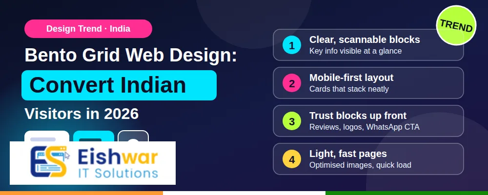
Bento Grid Web Design: Convert Indian Visitors in 2026
Introduction
Indian visitors decide in seconds. If your homepage feels cluttered, they move on. That is why bento grid web design is gaining attention among Indian businesses in 2026. It gives every offer, product, proof point and action a clear home without making the page feel heavy.
A bento grid layout uses modular tiles, much like a Japanese bento box. Each tile has a purpose. Some are big for priority messages. Some are small for quick links. Together, they create a clean, scannable experience that works on mobile, tablet and desktop.
For business owners, marketers and professionals in India, this is not just a design trend. It is a practical way to improve clarity, build trust and increase conversions in a market where attention is limited and competition is high.
Main Section 1: What Is Bento Grid Web Design and Why It Matters in India?
Bento grid web design is a layout style that arranges content in distinct tiles or cards inside a structured grid. Instead of long rows of text and images, the page is divided into self-contained blocks. Each block can hold a product, service, testimonial, statistic, video, call to action or navigation shortcut.
What Makes a Bento Grid Different?
- Different tile sizes show different levels of importance.
- Consistent spacing and rounded corners create a calm visual rhythm.
- Each tile carries one idea, offer or action.
- Strong hierarchy uses size, colour, typography and contrast.
- CSS Grid makes the layout easier to control across screen sizes.
A bento grid is not the same as a masonry layout. Masonry often feels organic and uneven. Bento grid is more intentional. It feels ordered, balanced and easy to scan. That difference matters when you want Indian users to understand your business quickly.
Why Indian Audiences Respond to Bento Grids
India is a mobile-first market. Most users arrive on mid-range Android phones, often on slower networks. They may also switch between English, Hindi and regional languages. A modular layout helps because each tile can be read independently without losing the overall story.
Consider an Indian fintech website. A bento grid can show UPI payments, bill payments, insurance, loans and support in separate tiles. A D2C brand can highlight bestsellers, festive offers, reviews and delivery tracking. A local service business can place call, WhatsApp, map, pricing and testimonials in dedicated blocks. This structure reduces confusion and helps users take the next step faster.
Main Section 2: How Bento Grid Layouts Improve UX and Conversions for Indian Audiences
Bento grid web design is not only about looking modern. It solves real UX problems that affect conversions in India. Here is how it helps.
1. Faster Scanning and Decision-Making
Indian users scan before they read. A bento grid lets them spot the most important information quickly. Larger tiles can carry the main offer. Smaller tiles can handle secondary actions. This reduces cognitive load and helps users decide without scrolling through endless sections.
2. Mobile-First Modularity
On mobile, a bento grid can stack tiles in a logical order. You can move the most valuable tile to the top. You can also turn complex desktop sections into simple swipeable or stacked cards. This keeps the experience smooth on small screens and slower connections.
3. Better Visual Hierarchy for Offers
Indian businesses often promote many things at once: seasonal discounts, new products, EMI options, free delivery and customer support. A bento grid prevents all of them from shouting at the same time. You decide which tile is the hero, which tiles support it and which tiles are optional.
4. Trust Signals in Dedicated Tiles
Trust is a major conversion factor in India. Users look for reviews, ratings, secure payment badges, return policies and real customer photos. Bento grid design lets you place these trust signals in their own tiles. They become easy to find instead of getting buried in paragraphs.
5. Campaign and Personalisation Flexibility
Festive sales, regional offers and new product launches need flexible layouts. With a bento grid, you can swap one tile without redesigning the whole page. You can also personalise tiles based on user behaviour, location or language. For example, a visitor from Mumbai may see free delivery messaging, while a visitor from a smaller city may see cash on delivery and support options.
Main Section 3: How to Build a Bento Grid Website: Step-by-Step for Indian Businesses
You do not need a huge budget to use bento grid web design. You need a clear plan, a good grid system and a focus on performance. Follow these steps.
Step 1: Define the Primary Conversion Goal
Before you design tiles, decide the main action you want users to take. It could be a purchase, demo booking, WhatsApp enquiry, phone call or newsletter signup. Every tile should support that goal in some way.
Step 2: Map Content into Tile Types
List your content and group it into tile types. Common tile types include hero offer, product card, service card, testimonial, trust badge, video, stat, FAQ, contact and CTA. Keep one message per tile. If a tile needs two ideas, split it.
Step 3: Choose a Responsive Grid System
Use CSS Grid or a page builder that supports flexible grid layouts. A 12-column grid is a good starting point. Plan how tiles will behave at common breakpoints: 320px, 375px, 768px, 1024px and 1440px. The goal is simple: desktop feels spacious, mobile feels focused.
Step 4: Design Hierarchy Before Decoration
Decide tile sizes first. The most important tile should be the largest or the most visually distinct. Use colour, contrast and typography to guide the eye. Keep spacing consistent. A simple 8px spacing system makes the layout feel professional and easy to maintain.
Step 5: Optimise Performance
Indian users will not wait for a heavy website. Compress images, use modern formats like WebP or AVIF, lazy-load below-the-fold tiles and avoid unnecessary animation. If you use video tiles, make them click-to-play. Test your Core Web Vitals regularly, especially on mobile networks.
Step 6: Make SEO Structure Clear
A bento grid should still follow a logical heading structure. Use one H1, clear H2s and descriptive H3s. Add alt text to tile images. Keep important text in HTML instead of images. This helps Google understand your page and improves accessibility for all users.
Step 7: Test with Real Indian Users
Test on low-end Android phones, iPhones and desktop screens. Ask real users from your target city or industry to complete a task. Watch where they tap, scroll and hesitate. A tile that looks great in Figma may fail if the text is too small or the CTA is not clear.
Step 8: Measure and Improve
Use GA4, heatmaps and session recordings to see which tiles get attention. Track clicks, scroll depth, form submissions and WhatsApp enquiries. If a tile underperforms, change its position, copy or visual weight. Bento grid design works best when it is treated as a living system, not a one-time layout.
Expert Tips
- Design for thumb zones: Place primary CTAs where users can tap easily on mobile. Avoid tiny buttons in corners.
- Limit tile count: Too many tiles create clutter. Start with 5 to 9 tiles on the homepage and expand only when needed.
- Use real proof: Indian buyers trust local reviews, GST details, office photos and client logos. Give them dedicated tiles.
- Keep CTA language simple: Use action words like Book a Demo, Get Quote, Buy Now or Chat on WhatsApp.
- Respect regional languages: If you serve multiple states, test tile lengths in Hindi, Marathi, Tamil and other languages. Text expansion can break layouts.
- Do not make every tile clickable: Some tiles should inform, not distract. Too many links can dilute the main conversion path.
- Set a performance budget: Decide the maximum page weight and load time before design begins. This prevents beautiful but slow websites.
Common Mistakes
- Overcrowding tiles: Cramming too much text into one tile defeats the purpose of a bento grid.
- Inconsistent spacing: Uneven gaps and random corner radii make the design look messy.
- Ignoring mobile stacking: A grid that works on desktop may become confusing on mobile if the order is not planned.
- Using animation everywhere: Movement can distract users and slow down the page, especially on budget phones.
- Weak contrast: Low-contrast text may look stylish but hurts readability and accessibility.
- No clear CTA: If every tile competes equally, users do not know what to do next.
- Copying global brands blindly: Apple and Samsung have strong brand recall. Indian SMEs need to prioritise clarity, trust and local context.
Future Trends
Bento grid web design is likely to become more adaptive in 2026 and beyond. Expect layouts that adjust tiles based on user intent, device speed and location. A user searching for EMI options may see finance tiles first. A returning customer may see order tracking and loyalty tiles.
We will also see more regional-language tile personalisation, video-first product tiles and dashboard-style bento grids for SaaS and fintech. Performance will remain a major trend. Teams will design lighter tiles, use responsive images and follow Core Web Vitals as a non-negotiable part of the design process.
Another trend is composable commerce. Indian D2C brands will mix product tiles, UGC tiles, offer tiles and support tiles without rebuilding the entire page. This makes campaigns faster to launch and easier to optimise.
FAQs
What is bento grid web design?
Bento grid web design is a modular layout style that organises content into distinct tiles of different sizes. Each tile has a clear purpose, such as a product, service, testimonial or CTA. It creates a clean and scannable user experience.
Is bento grid design good for Indian ecommerce websites?
Yes. It helps online stores show products, offers, reviews, delivery information and support options without overwhelming users. It works especially well for mobile-first shoppers who scan quickly.
Will a bento grid slow down my website?
Not if you build it properly. Use optimised images, limited animations, lazy loading and clean CSS. A simple bento grid can be faster than a complex traditional layout because it avoids heavy sliders and long scripts.
How many tiles should a bento grid have?
For a homepage, 5 to 9 tiles are usually enough. Each tile should support a specific goal. Add more tiles only when they improve clarity or conversions.
Can I use bento grid design on WordPress or Shopify?
Yes. Many modern themes and page builders support grid or card layouts. You can also use custom CSS Grid. The key is to keep the structure responsive and performance-friendly.
Does bento grid design hurt SEO?
No. As long as your content is in proper HTML headings and text, and your page loads quickly, bento grid design can improve engagement and SEO. Avoid placing important text only inside images.
Conclusion
Bento grid web design gives Indian businesses a practical way to present complex information in a simple, modern format. It improves scanning, supports mobile-first behaviour, highlights trust signals and makes campaign updates easier.
The best bento grids are not the most decorative. They are the clearest. Start with your main conversion goal, map content into useful tiles, optimise for speed and test with real users. When done well, this layout can turn a busy website into a focused conversion engine for 2026 and beyond.
CTA
Ready to redesign your website with a high-converting bento grid layout? EishwarITSolution helps Indian businesses plan, design and build fast, modern websites that turn visitors into customers. Visit eishwar.com to discuss your project today.